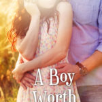
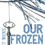
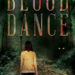
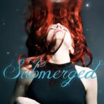
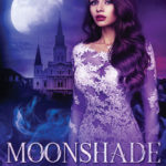
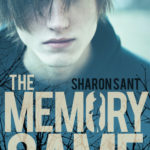
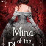
Series covers can be visually linked in a variety of ways. The most common are fonts and text placement, though over-all image tone, style and color schemes can also play a huge role. I’ve compiled a visual comparison of several series from Paper & Sage below.
Please click on the images below to see a larger version of each cover!
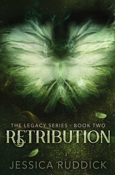
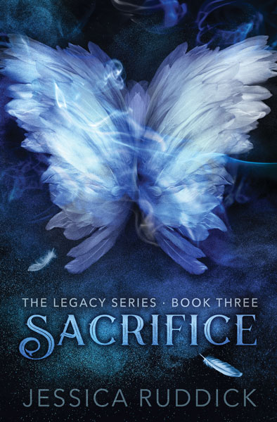
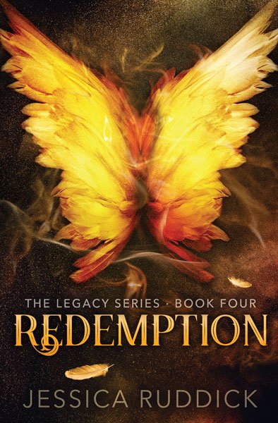
The Legacy Series by Jessica Ruddick. This series has a very strong visual continuity across titles, with the color and wing-shape as the primary changes across each cover. As a YA fantasy series about angels and the Grim Reaper, we wanted a strongly contrasting, monochromatic color scheme for each cover.
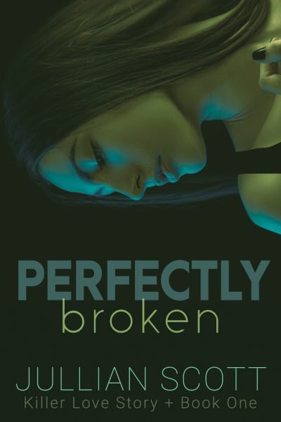
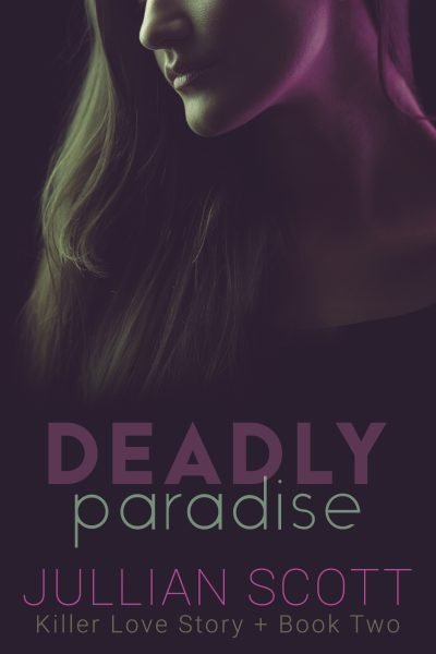
The Killer Love Story series by Jullian Scott. The dark color palletes underscore the similarly dark mystery and suspense elements of this series.
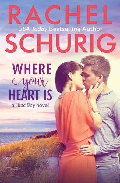
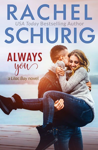
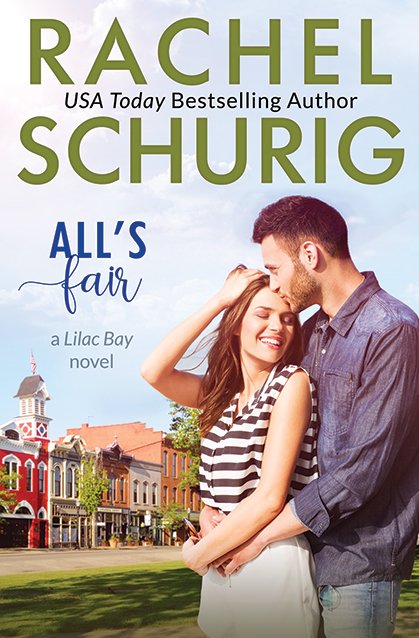
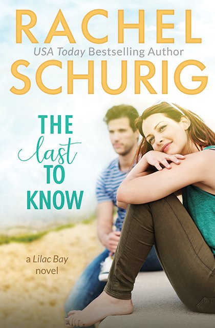
Lilac Bay Series by Rachel Schurig. A series of romance novels set on the same island, featuring a different couple for each story. We’ve used bright colors and poses to highlight the light-hearted tones of this contemporary series.
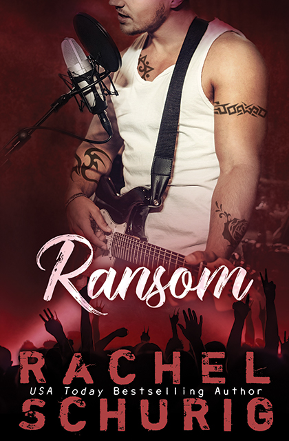
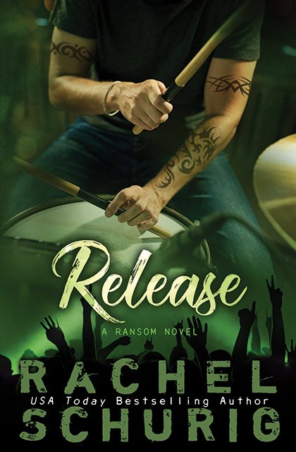
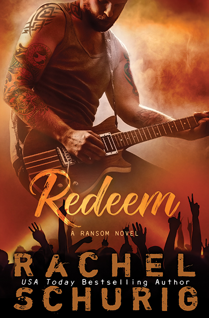
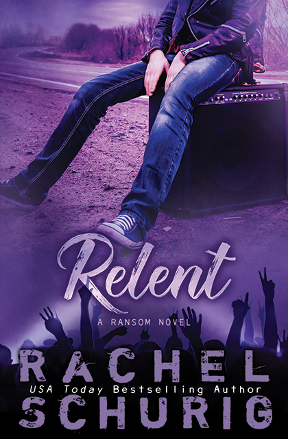
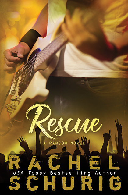
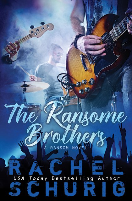
The Ransom Series by Rachel Schurig. Bold colors, a single model and the crowd image along the bottom tie these together visually to create a strong series look, clearly communicating that this is a contemporary romance series about a rock band.
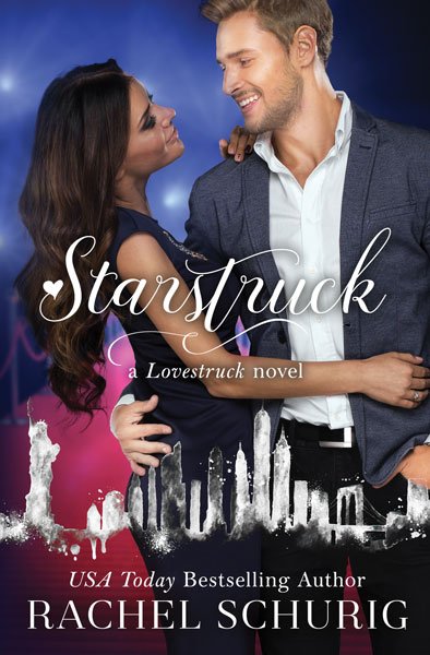
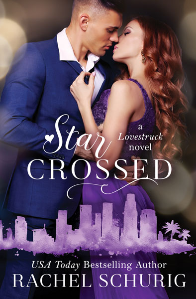
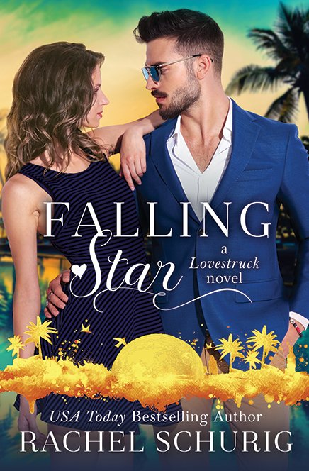
The Lovestruck Series by Rachel Schurig. The first three titles in this series feature the same couple, then the last three have different couples in the staring role. The setting also plays a big role in each story, so we’ve highlighted that by featuring a watercolor-version of the skylines along the bottom of each cover.
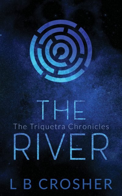
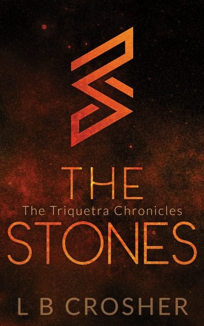
The Triquetra by LB Crosher. The contrasting ‘glittering’ and black background, brightness of a single color, and abstract symbols highlight the magic and intrigue in this YA series.
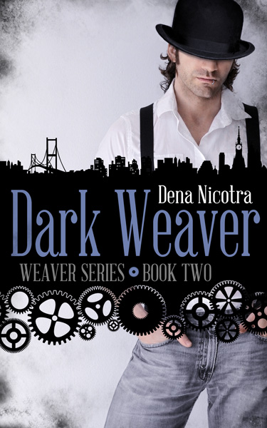
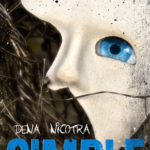
The Weaver Series by Dena Nicotra. Like
The Grounded Series above, there are several repeating elements (the title frame with a city and gears, a changing model, etc.), but the over-all design is a bit more flexible, which fits the time-travel and history-changing elements of the series.
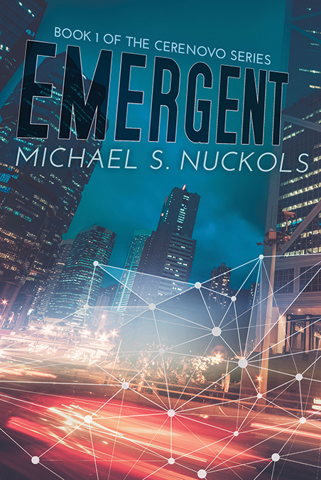
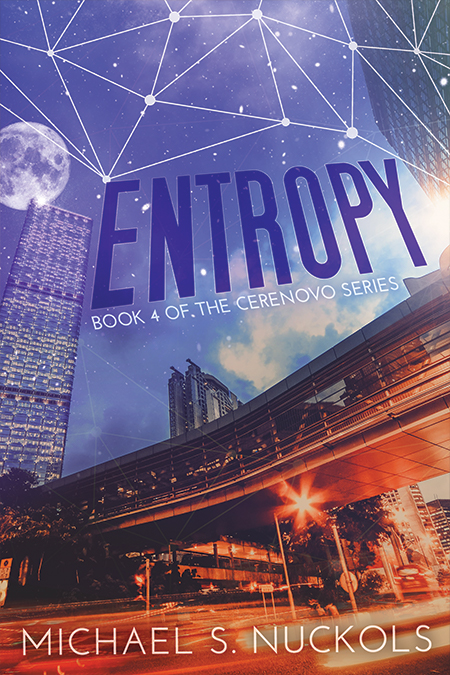
The Cerenovo Series by Michael S. Nuckols. This sci-fi series focuses on how ‘the line between biological evolution and technological advancement blurs’. The covers combine those ideas along with relying on bright, eye-catching colors and a bold font for the title.
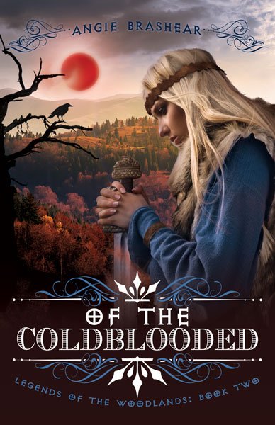
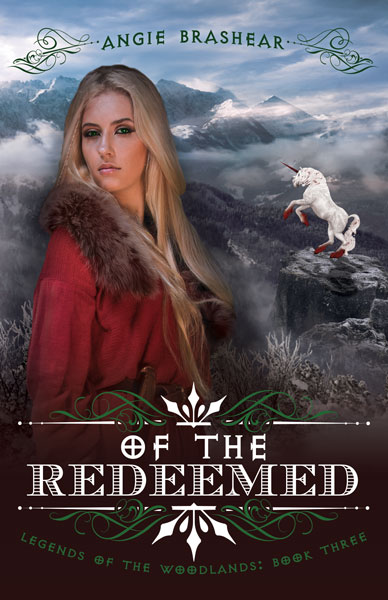
The Legends of the Woodlands by Angie Brashear. For this series, we wanted to incorporate a specific creature on each cover as well as sweeping landscapes behind the model to capture the epic-style fantasy genre. Then we chose to have the model turn toward the viewer as the series progressed, to help capture the YA protagonist’s growth throughout the series.
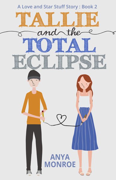
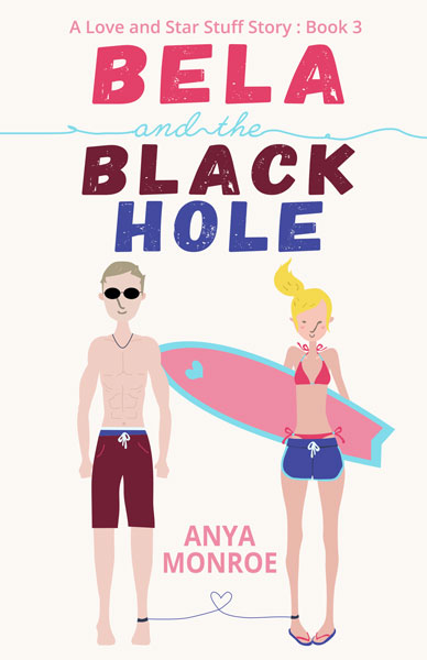
The Love and Star Stuff Series by Anya Monroe. For this playful series, we kept the placement of each element identical (title at top, couple sized and positioned the same in the middle, author name at the bottom, etc.) so we had a lot of flexibility with fonts and character details. Typically we recommend maintaining the same font throughout a series because that one element is a huge part of series cohesion, but in this case, by keeping the other elements aligned, we took the chance to play with the fonts and have them really set the tone for each book.
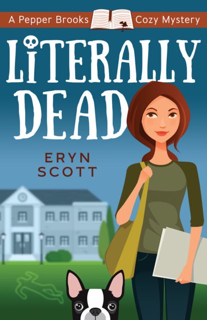
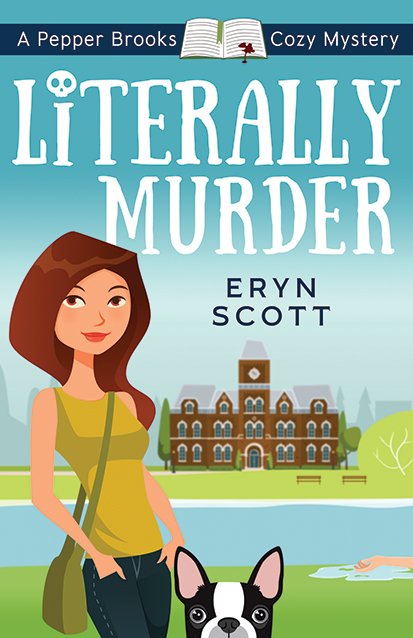
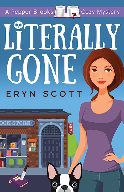
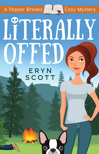
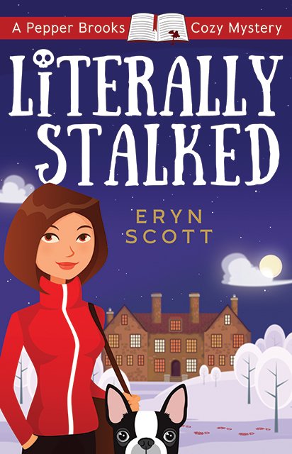
The Pepper Brooks Cozy Mystery Series by Eryn Scott. Eryn Scott’s
Pepper Brooks mysteries are visually very different from her
What’s in a Name? covers (shown above). We chose vector designs for this series because they are associated quickly with the cozy genre and are quite different from the photographic designs for her other covers, which helps set these cozy mysteries apart from her chick lit and romance titles.
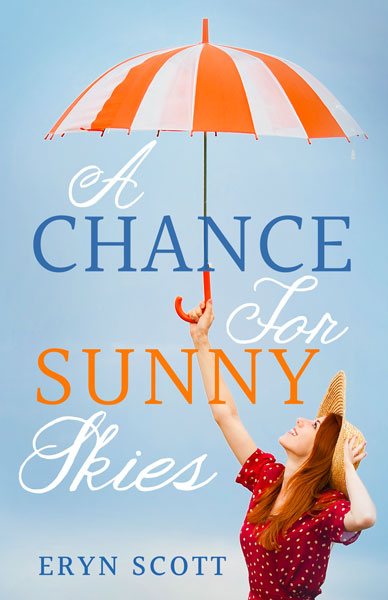
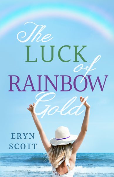
What’s in a Name? by Eryn Scott. This is a light-hearted and comedic women’s lit series. We used bright, eye-catching colors and playful poses and expressions to highlight the genre and tone. The titles can also be read as standalone, so we wanted to keep that in mind, too.
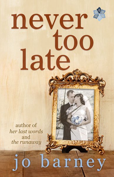
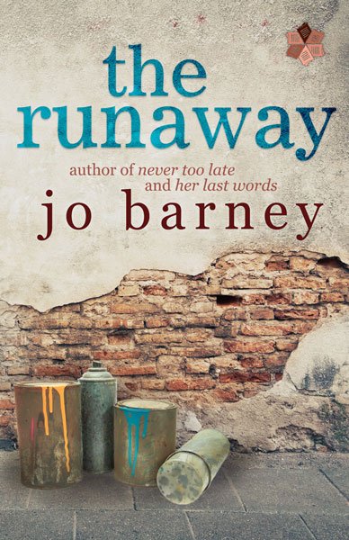
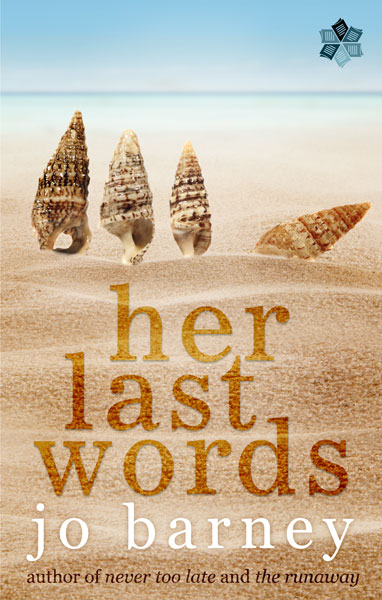
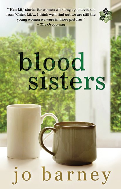
Never Too Late, Her Last Words, The Runaway and Blood Sisters by Jo Barney. These are strongly branded, but individual titles from Jo Barney. We’ve kept the fonts and capitalization scheme consistent throughout, but the layout, imagery and color palettes remain very flexible. As standalone titles with a strong visual brand, we want these covers to be obviously linked and recognizable as Jo Barney titles, but we don’t want to compromise the flexibility for very different (aka non-series) stories.
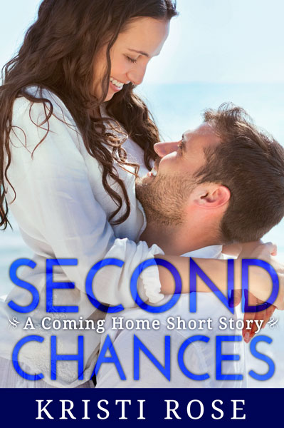
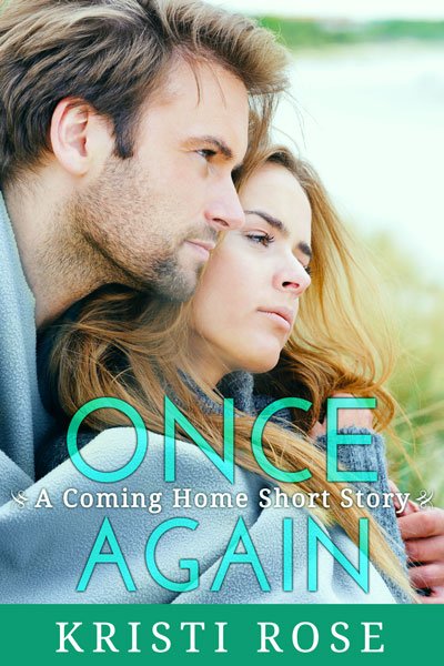
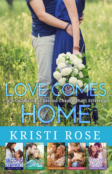
Coming Home Short Stories by Kristi Rose. These short, sweet romantic reads all take place in a small town, with each story featuring a new couple. They’re fun, lighthearted reads so we relied on bright pops of color for the titles and a close-up shot of a couple for each of the 5 short stories. The sixth cover featured above,
Love Comes Home, is the collection cover, so we’ve cropped that couple differently to create a similar, but different look to set it apart as the Collection cover.
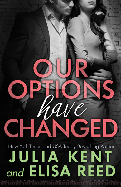
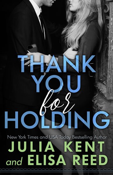
On Hold series by Julia Kent and Elissa Reed. We wanted to focus on a bold eye-catching title and author names on these covers. These are loosely linked to Julia Kent’s Billionaire series, so we also wanted to have a san serif and hand-written fonts as a subtle visual tie-in, but still give this series a look that’s unique.
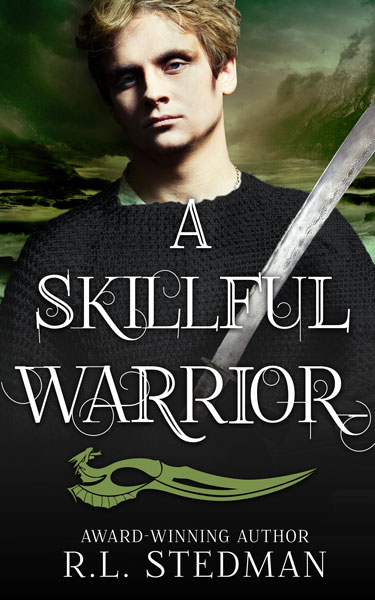
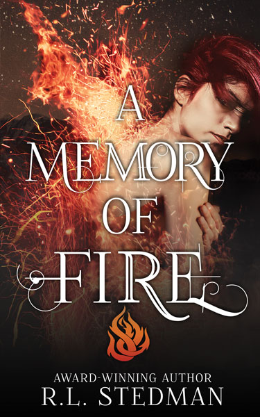
The SoulNecklace Stories by R.L Stedman. The structured title layout and symbol at the bottom of the cover allowed for a lot of flexibility in the cropping and tones on the model and setting images for each cover.
[/su_carousel]
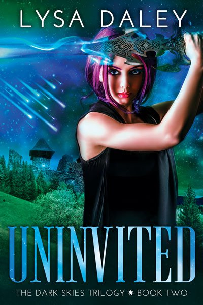
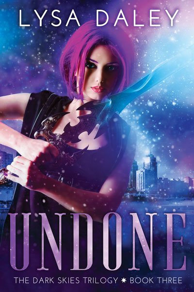
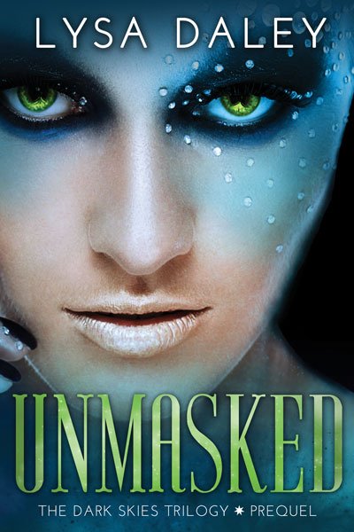
The Dark Skies Trilogy by Lisa Daley. The trilogy maintains the same fonts, model and over-all color scheme, but with a very flexible background to reflect the storyline. The fourth image seen here is a Prequel for the series. We’ve kept the text placement and textures, but significantly changed the cropping of the image, to highlight the fact that this is a different type of story, though still part of the series.
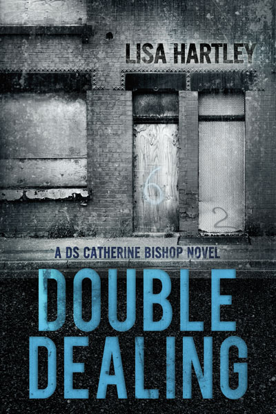
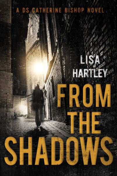
The DS Catherine Bishop Series by Lisa Hartley. We wanted to keep a high-contrast, gritty tone for this crime series. Like the
On Hold series above, these covers rely on a black and white image and a colorful title. However, the tone is very different to match the crime genre: note the richer, darker color choices for the title and accents and the higher-contrast black and white of the images used, along with the rough textures and fonts.
Updated 10/2020